Absolutely goes in search of advice on the whiter shades of pale
Words Pendle Harte
Choosing paint colour for your walls is daunting. It’s tempting to go for white because it’s always stylish in an airy, Scandi way – and it will make your rooms seem bigger, too, right? Unfortunately, wrong. Apart from that not necessarily being the case, just choosing white isn’t really any kind of decision because the concept of white probably covers more shades than any other colour. You might have chosen white, but which white is it? We’ve called in the experts at Farrow & Ball for advice.
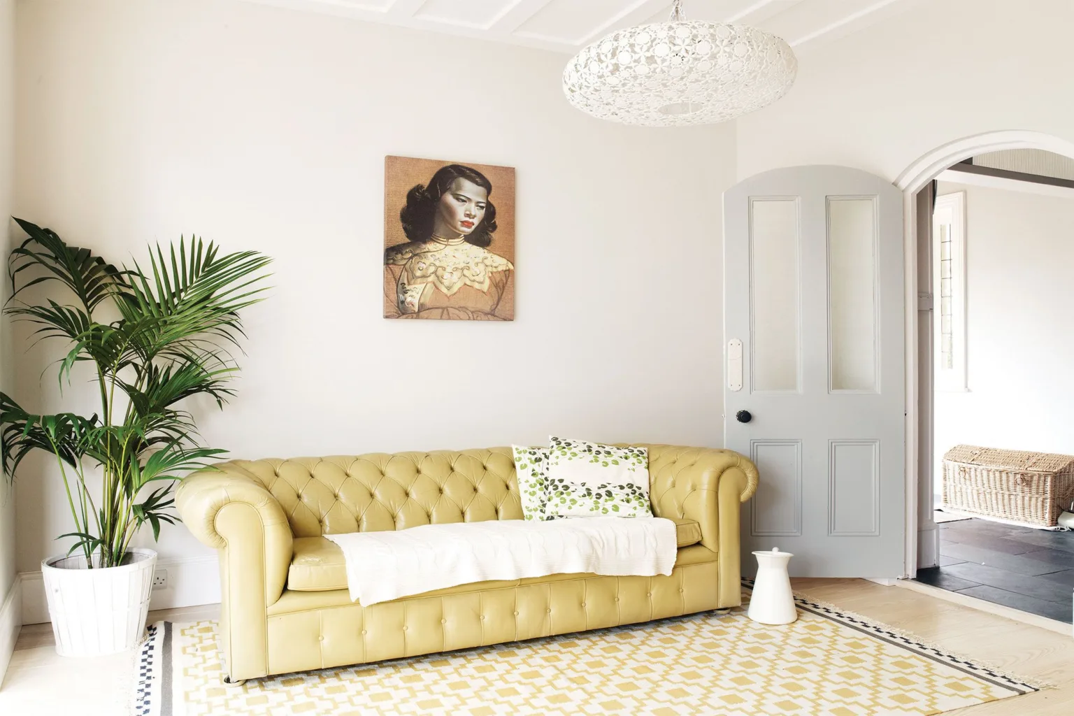
A brief look at colour cards will show a vast spectrum of whites. And interestingly, what we see as white has become more and more grey over recent years. “Our perception of neutral has changed; what we felt was white 15 years ago is now incredibly yellow to the modern eye,” says Joa Studholme, Farrow and Ball’s international colour consultant and probably the UK’s most influential colour guru. “We’ve gone greyer as time goes on. All our greys are selling like hot cakes — and these are becoming the new neutrals; soft and organic, as in French Gray or Pigeon, or darker, even going into Off-Black walls with Pitch Black woodwork. What has replaced magnolia as the classic neutral is a cool, chalky Cornforth White, which has a grey undertone. Nobody wants colours with a yellow base any more.”Not that she’s all that keen on an all-white scheme throughout a house, and her belief is that, counter-intuitive as it may sound, painting a dark room white isn’t going to disguise its darkness – and anyway, darkness isn’t necessarily always a bad thing. ‘A small space painted white is very boring,’ she says. Generally, it’s good to try strong colours in north-facing rooms, while south-facing rooms can remain neutral,’ she says. Sympathetic whites are calmer and more interesting looking than dazzling, toothpaste whites that can feel cold and stark. A warm white, on the other hand, can be cosy and create a good backdrop for colourful furnishings as well as contrasting skirting boards, doors, window frames and architectural details.
‘Think about the architecture. Do you want features such as cornicing to stand out? But don’t be a slave to it. Just because it’s a Georgian house don’t think you have to have a Georgian colour scheme. And of course, light is key. Ultimately, it’s what you feel comfortable with,’ says Studholme.
When decorating, it makes sense to start with the hall. For one thing because it creates a first impression, and for another it can set the tone for the rest of the house. Paint it a dramatic dark shade, for instance, and it will create the illusion of extra brightness for rooms leading off it. Also, painting doors and frames the same colour can create a grander, more finished effect, and coloured doors add interest to white walls and ceilings.
Whether you want a warm white or a cool one, a clean one or a muddy one, tester pots are the only way And for more advice, consult Joa Studholme’s invaluably detailed, practical and inspirational new book, How to Decorate, published this month by Octopus Books, £30.
Farrow and Ball showrooms can be found at 249 Fulham Road, SW3 6HY and 21/22 Chepstow Corner, W2 4XE


